Walls That Spoke: HCI 2009’s Venue Map and the Architecture of Disciplinary Status
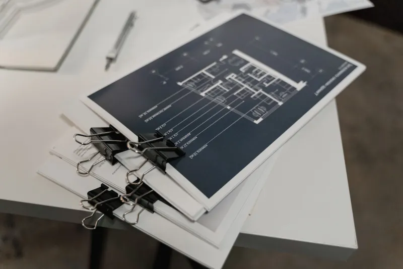
The HCI 2009 Archive holds a modest but revealing set of venue documents: a folded floor plan, a printed session grid, and a handful of room-capacity notes pasted into the delegate pack. These are not the conference’s headline artefacts. They do not record a keynote’s argument or a paper’s findings. Yet they preserve something equally consequential: the spatial grammar through which the programme was made legible to its attendees. To read the floor plan is to read an argument about disciplinary priority, albeit one that was rarely stated aloud.
The Surviving Venue Record and Its Limits
The archive’s copy of the venue map is incomplete. One wing is annotated in pencil; another is a photocopy of a photocopy. The session grid, by contrast, is cleanly typeset, listing parallel tracks across three days. Neither document is neutral. Room allocations are the product of negotiation, habit and constraint. A main auditorium seats several hundred; a seminar room seats forty. When a topic is placed in the former, it is granted a certain visibility. When it is placed in the latter, it is not necessarily suppressed, but it is made smaller.
The records we hold suggest a venue of conventional late-2000s design: a central lecture theatre, two mid-sized halls, and a cluster of smaller rooms along a corridor. The corridor itself appears on the map as a thin line, but in practice it was where the conference’s informal economy operated. The archive has already noted the unminuted nature of those spaces. Here, the concern is the planned geography: which sessions were given the big room, and which were asked to make do.
Capacity as a Claim
The largest room was reserved for opening and closing keynotes, a panel on the future of interaction, and a session on mobile and domestic technology. These were the conference’s public face. The capacity notes in the delegate pack indicate seating for 320 in the auditorium, with overflow provision. No other room exceeded 120. This asymmetry is not surprising, but it is evidential. It tells us which themes the organisers expected to draw a crowd and which they expected to serve a specialist audience.
A session on assistive technology, for example, was scheduled in a room with a stated capacity of 60. A workshop on low-cost evaluation methods occupied a room of similar size. Neither was marginal in intellectual terms, but the spatial allocation placed them at a remove from the main thoroughfare. Attendees had to choose to go there. That choice was shaped by the map.
The Parallel Track Problem
Parallel tracks are often described as a necessary compromise. The session grid shows how that compromise was managed. Two prominent streams—one on interface design theory, one on empirical studies of use—ran concurrently on the second afternoon. They were placed in the two mid-sized halls, separated by a foyer. The proximity was practical, but it also created a visible rivalry. Delegates moved between them, and the corridors became a place of comparison.
Smaller streams were not given the same adjacency. A track on participatory design methods was allocated a room at the far end of the venue, past the catering point. The archive cannot say whether this was deliberate or merely the result of room availability. What it can say is that the spatial arrangement made informal crossover less likely. A delegate leaving the interface design session could easily slip into the empirical studies hall. Reaching the participatory design room required a longer walk and a clearer intention.
Margins in the Programme
The floor plan also records the position of the poster floor and the demonstration area. The posters were placed in a wide corridor rather than a dedicated room, a common arrangement that maximised footfall but also exposed presenters to the venue’s through-traffic. The demonstration floor was given a similar semi-public position. These were not secondary in the programme’s rhetoric, but they were secondary in its architecture.
Such arrangements matter for the historical record because they shaped who spoke to whom. A paper presented in a small room may have been heard by fewer people, but those present were likely to be more committed. A paper presented in the main hall reached a larger audience but may have been received more passively. The archive’s task is not to adjudicate between these outcomes, but to note that the venue plan made them possible.
Reading the Grid in 2026
The temptation, from the vantage of 2026, is to treat the 2009 floor plan as a quaint artefact. That would be a mistake. The same questions about room allocation, track placement and the visibility of specialist topics persist in contemporary conference design. The HCI 2009 documents offer a baseline against which later arrangements can be compared.
Methodologically, the archive urges caution. A room’s capacity is not a direct measure of a topic’s importance. A large room may reflect expected attendance rather than intellectual esteem. A small room may indicate specialism rather than marginality. But when capacity, timing and location are read together, patterns emerge. The main auditorium hosted the themes the organisers wished to foreground. The corridor rooms hosted the themes that required a deliberate journey.
Conclusion: The Plan as Evidence
The HCI 2009 venue map does not speak in sentences. It speaks in proximities, capacities and parallel lines. It records the decisions that made some conversations easier and others harder. For an archive committed to preserving the conversations that shaped UX, such documents are not background. They are part of the record. To ignore them is to assume that ideas circulate in a vacuum. They do not. They circulate in rooms, along corridors, and through the quiet architecture of the programme.